Monday, July 28, 2014

Fused Glass Nightlight


Fused Glass Nightlight made with 96 Cane

Monday, April 7, 2014

Henri Rousseau and The Tiger

This post is for my niece, Adi…I wanted to introduce her to the paintings of Henri Rousseau and share a few of the projects that I've been working on with my art students. The book, "The Fantastic Jungles of Henri Rousseau" written by Michelle Markel and illustrated by Amanda Hall, tells the story of Henri Rousseau with beautiful pictures inspired by his style of painting.
"The Fabulous Jungles of Henri Rousseau"
tells a nice story of Rousseau's life and shows
beautiful interpretations of Rousseau's paintings.
To color your own illustration out of the book, you can check out this link and download one of the illustrations of Henri Rousseau riding a tiger!

Henri Rousseau coloring page
I've divided this project into three sessions, but you can do it all at once if you feel like it. Don't rush through it, though! Take your time and practice your techniques to make the best art that you can. If you get tired of working on it, take a break and come back to it later. Remember that after each session, we need to clean up our workspace, so make sure to schedule at least 5 minutes for clean up!
Rousseau's Tiger

We're going to create a tiger that could live in one of Henri Rouseau's paintings!
At the end of session 1, you'll have a tiger that looks like this.

For the first session, you'll need a sheet of construction paper (yellow, pink or light blue), a pencil, & black oil pastel (or black crayon). First, we need to make our tiger. To create the outline of our tiger body, you'll want to draw a big "X" on the yellow construction paper with a pencil. Is your "X" big so that it almost fills the paper? If the "X" looks good to you, then we can grab our black crayon or black oil pastel and trace the "X."
Session 1 ~ Drawing a tiger with black oil pastel (or black crayon)

Next, draw a line across the top of the "X" to make the head of the tiger. Fill in facial features: ears, eyes, nose, mouth, whiskers, and then fill in the tiger's stripes.
We're only using the black oil pastel (or crayon) for this first part of the project. Once we color in all the parts of the drawing that are black, we can move on to the next step: Creating a color wash.
Session 2 ~ Adding a color wash
For the second session, we'll be creating a color wash. You'll need: the tiger drawing you made, a palette for mixing paints, a wide, flat paint brush, blue, red and yellow paints, a bowl of water and an old rag, paper towel or damp sponge.

A "Wash" is a very light coat of paint that we apply to our paper. We should still be able to see a bit of the color of the construction paper behind the paint wash. To make a paint suitable for a wash, grab your palette, a bowl of water, a big, flat paintbrush and your blue paint.
Steps for mixing blue paint into a wash.
Squeeze a drop or two of the blue paint into one of the dips in your palette. Now, add some water: Dip your brush into the bowl of water and then mix the paint with your brush. The water from your brush should thin out the paint. Without cleaning your brush too much, dip the brush in the bowl of water again to pick up more water. Mix the blue paint again, so it's very watered down. Now, you can apply the blue wash to the background of the painting. Try to stay outside of the tiger lines because we will apply an orange wash in the tiger.
Applying a wash: Don't dip your brush into the paint after every stroke.
Spread the watery paint around until the brush is dry, then load the brush
with more paint. If you run out of paint, mix another batch. Try to keep
it about the same consistency as the batch of paint you just used.
Notice how I'm holding the brush in the above pictures. The flat edge should follow the lines of the tiger's head and body. Only dip into the paint after your brush is almost dry.

What is the background of your painting?
What is the foreground of your painting? 
Is the subject of your painting in the foreground or the background of your painting?


Time to clean our brush before mixing up some orange paint. Make sure that you've cleaned your brush thoroughly of the blue paint. Wash your brush by pushing it gently against the bottom of the bowl with water in it. Be gentle so you don't send water flying everywhere and so that you're nice to your brush. If you're nice to your brush, it will last a long time! After tapping the brush along the bottom of the bowl, dab it dry by pulling it along the rag, paper towel or sponge. This will get rid of any blue paint still in your brush.

Making Orange Paint from Two Primary Colors

Now we need to mix an orange paint. Do you know what colors we need to mix to make orange? There are two colors that we'll use to make orange, and one of them is lighter than the other one. When you're mixing colors, you want to start with a little of the lighter color in your palette and then add a bit of the darker color and mix. If the color isn't dark enough, add just a bit more of the darker color and mix again. (If you start by adding the light color to the darker color, then you end up mixing a lot more paint than you need.)


After we've mixed a little of our orange paint, we need to add water to make it watery enough to be a wash. If you want to get clean water, you can rinse your bowl out and get fresh water. Otherwise, you can use the blue water to mix water into your orange paint. It will make it a little less bright, but it will still look good.


Apply your orange wash to the tiger, trying to stay inside the outlines, so you don't mix blue and orange paint washes. Now, we need to let the painting dry before continuing to add more elements to the painting.

Time to let the paint dry so we can add the next layer.
For the third session, we'll finish off our tiger painting by adding leaves of the jungle that the tiger is hiding behind. For this session, you'll need: green construction paper, bright green foam, scissors, black oil pastel and black chalk pastel, and a glue stick.

Session 3 ~ Materials: scissors, glue stick, oil pastels, chalk pastels,
green construction paper, green foam

We'll start by cutting out some leaves from the green paper and foam. What shape is a simple leaf? Cut the green construction paper in half. You can fold the paper over on itself to find the middle and then cut along the fold line. Cut the green foam roughly in half lengthwise.

Cutting and coloring leaves: Fold the green construction paper in
half hot dog style (lengthwise). Cut along the fold line.
Cut each strip into triangles. Draw in the leaf veins.
Cut the green foam in half. Cut almond shapes out of the foam.

After cutting the green construction paper and foam in strips, we're ready to cut out our leaf shapes. You can cut triangles out of the strips, or perhaps almond shapes. Once the leaves are cut, it's time to add the leaf veins with the oil pastel. If you want to use the green oil pastel instead of the black, you could do that, too. What does a leaf look like? Maybe you can find a leaf outside to study. Then, draw the leaf veins where you think they should go.


 If you used black crayon instead of black oil pastels, you may want to go over some of the black lines with black chalk pastels to make them stand out more. Then, the next step is glueing the leaves to the tiger painting so it looks like the tiger is hiding behind the leaves ready to pounce!
Glue the green construction paper leaves, first.
Then, glue the foam leaves on top.
At bottom, you see two different tigers, one on blue construction paper
and one on yellow construction paper.
The tiger in the bottom right corner above has chalk pastel outlines added. He also has some dimensional leaves made out of toilet paper rolls added, too.

Hope you had fun making your tiger! Make sure to take a picture and share it with me?
Love, Aunt Carrie

Resources:

Wednesday, February 26, 2014

Taking and editing self-portraits ~ CLASS co-op art class


Step one ~ Take a "selfie" or have someone else take your photo. Make sure that you have a monotone background. A wall works really well for this. If you've got a photo that you'd like to use already, you can adjust it to work for our self portrait purpose. Here are several photos that I looked at:
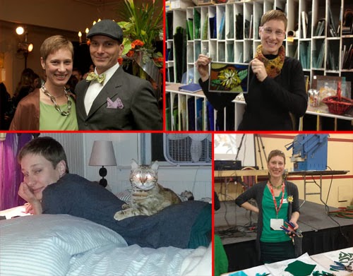
Several pictures that I had that I thought might work...
Step two ~ Edit the image using a photo-editing program. If you've got one you're comfortable with using, feel free to use it. I'll be giving a short step-by-step for using http://pixlr.com/
 To decide which photo I wanted to use, I decided to upload and crop them so that I could get an idea for how I looked, and how my background looked.

When you go to pixlr.com, you will see this:

pixlr.com website
Click on Pixlr Editor (the butterfly at the left) and then we are given the options for retrieving our images. To Upload an image from your computer, click on that option:
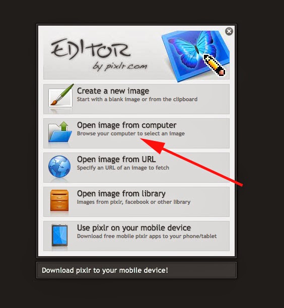
Click on "Open Image from Computer" and find the file you want to upload.
First, we need to crop our image.  Select the crop tool if it is not already selected. It's the tool in the very top left of the vertical toolbar to the left of the pixlr program. Change the "Constraint" setting to "Aspect Ratio" with a width of 8 and a height of 10. When cropping the image, try and make your head and face fill about 2/3rds of the frame:
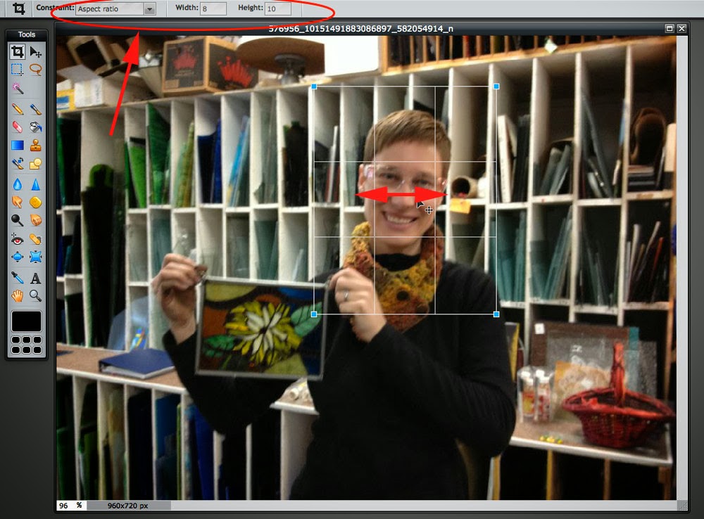
Crop: select "aspect ratio" constraint at width=8 and height-10.
Make your face fill about 2/3 of the crop box.
If you've got several images you want to compare, you can start by cropping them all at once. This might be enough to help you decide which image you like best. I'm leaning towards the third picture below. But, I'm going to demonstrate the next step with the second image, just to see how much or little the background gets in the way with my portrait.
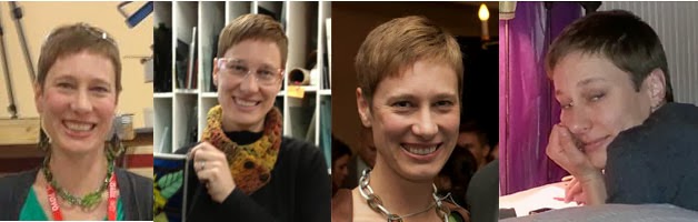
First thing to do is crop off possible portrait pictures
so that your head or face fills most of the frame.
Next step in image editing is to Adjustment > Desaturate. This is the common way that someone will list menu items in editing software. If you go to the top menu bar, you will see "Adjustment" listed halfway across. It's between "Layer" and "Filter." When you select "Adjustment," you'll see a drop down menu with more choices. Head on down to "Desaturate." That's going to take all of the color out of our image, and we'll end up with a greyscale image that's perfect for helping us to judge the values that we'll use when painting.
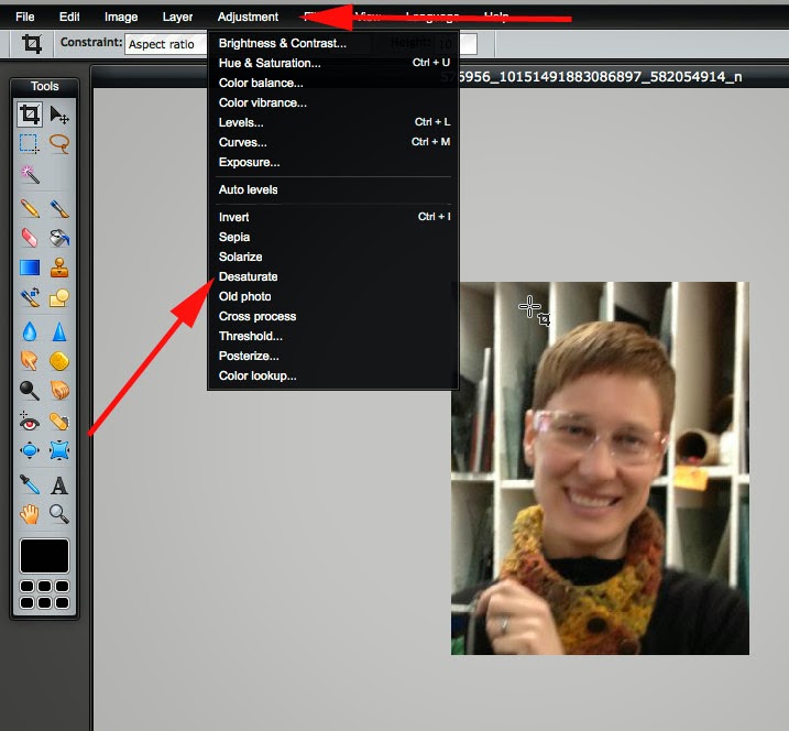
Desaturate: Adjustment > Desaturate
If you're still working on several images, go ahead and desaturate all of them. If you're not sure what steps you've done on the photo, you can always check out the image history:
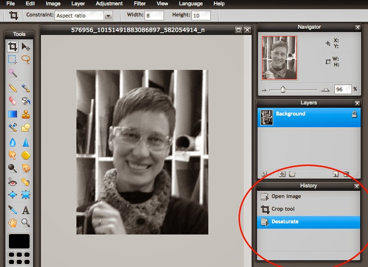
The History window tells you the story of your editing. What step am I on?
Now, it's time to adjust the brightness of our photo. We're going to do that with "Levels."
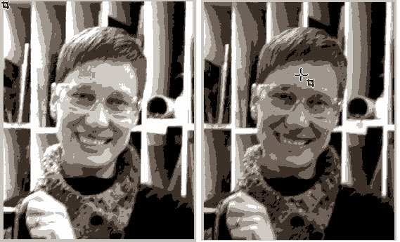
The images above have been "Posterized" already.
The only difference between the two is "Levels" adjustment.
The two images above have already been "Posterized" (last step) to show you the difference that adjusting the Levels makes. Notice that the very light values are missing from the photo on the right. That one did not have it's levels adjusted. Those missing values will make it harder for us to create our portraits, as there will not be as much definition / difference in the values.
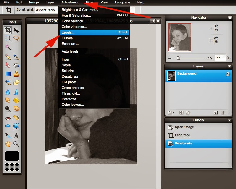
Adjust the levels: Adjustment > Levels
When you click on the "Levels" option (not "Auto Levels"), a new window pops up that will allow you to adjust the values of your photo.
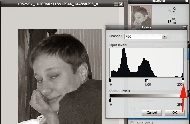
A pop up window appears with different slider buttons
for adjusting the values of our photo.
First, use the white button and slide it to the edge of the "mountains." We want to eliminate any bits of the photo that are too far to the left or right of this window. We want the mountain range to run across the entire rectangle of white in this menu. Does that make sense?
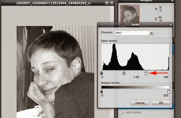
Move the white button slider to the left
until you've almost touched the bottom of the mountain.
That should have visibly made your photo much lighter. Squint your eyes and look at the photo to see if it needs more adjustment. Do the values have enough contrast? That is, can you see areas that are almost white and areas that are almost black? We want to maintain some areas of grey, too...
If there's a lot of space to the left of the mountains, you'll want to adjust the black button slider, too:
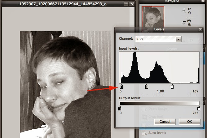
Move the black button slider to touch the edge of the mountains.
There wasn't a lot of space between the left of the screen and the left of the mountain range in my photo, but it does make a tiny difference. The last slider will help us adjust the values even more.
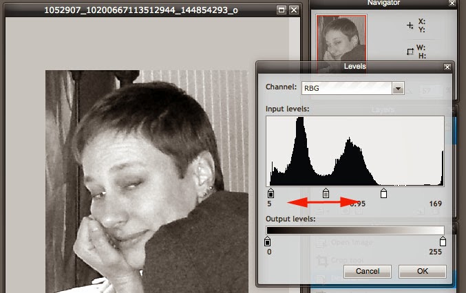
Play around with the middle slider to see what happens.
If you don't like what you did, press cancel.
Move the grey slider back and forth and see if you get an image that you like. It should have plenty of light and dark with different levels of midtones (in between the light and dark). If you don't like what you did with the slider, just press "cancel" instead of "ok."
If you feel like you made a mistake and you need to get back to a spot before the editing that you have done, head on over to the history window. It lets you move back and forward between steps to compare what you've done. However, once you make a move, it will replace any previous history (if you've gone backwards and made a move, you can't go forward to the step that you replaced).
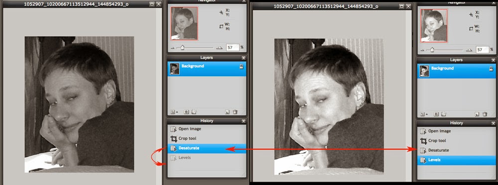
You can use your history window to go back and forth between actions.
If you did something you don't like, just go back in time!
Now, that we're happy with our Levels, we can add a blur effect. We want to use "Gaussian Blur," which lives in the "Filter" drop down menu.
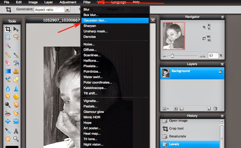
Blur Effect: Filter > Gaussian Blur
Not all photos will need the blur.  The previous photo I was working on didn't need it. The "Gaussian Blur" default in pixlr is "50." That's a lot of blur!
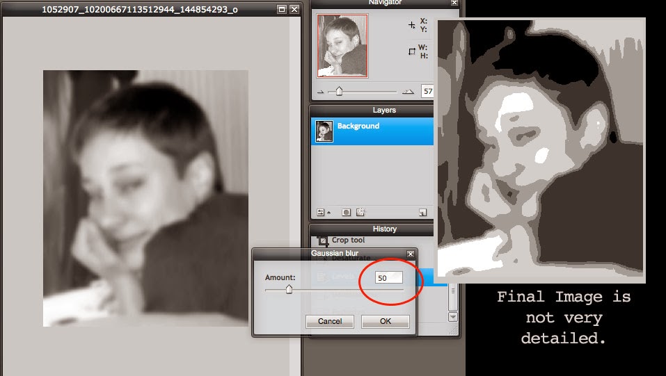
If there's too much blur, then we lose detail and our final image
doesn't have as many different values as it could have.
The example above shows what happens with the final step of "Posterization" if we don't have enough detail. Notice, there's a lot of midtones. Our painting will be very boring if most of the canvas is covered with the same values.
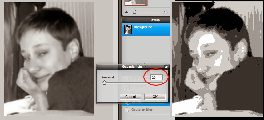
Some photos won't need a blur effect.
But, 20 is typically the highest setting we want to use.
Notice the difference in detail between the two Gaussian Blur images. It's subtle, but important.
Okay! We're almost ready for the last step! I bet you're glad for that, huh?
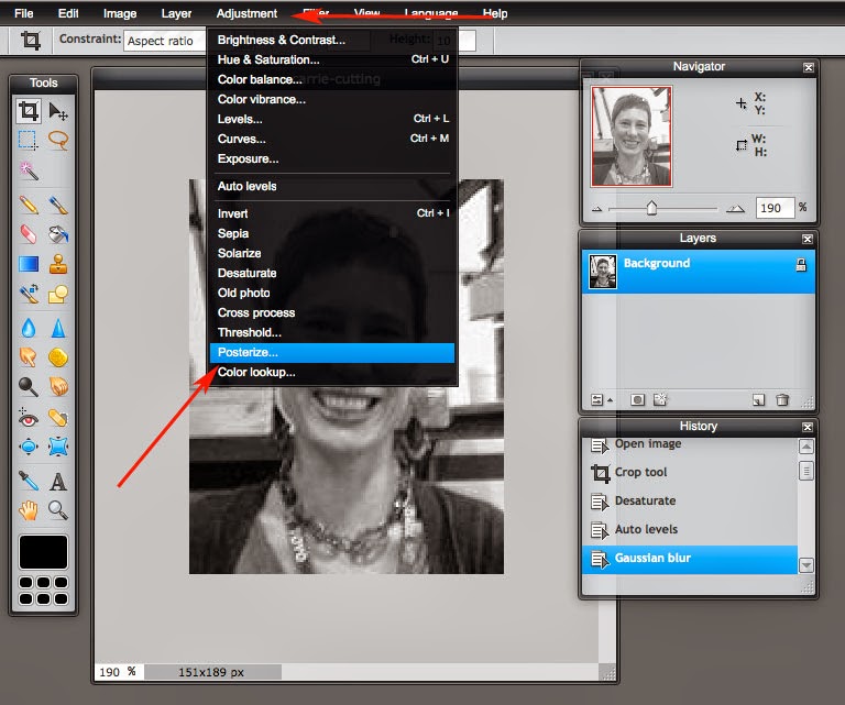
Last step: Adjustment > Posterize
The last step is what changes all of our values into similar groups. We want 6 different values in our photos. So, we need to change the default setting of 4 to 6.
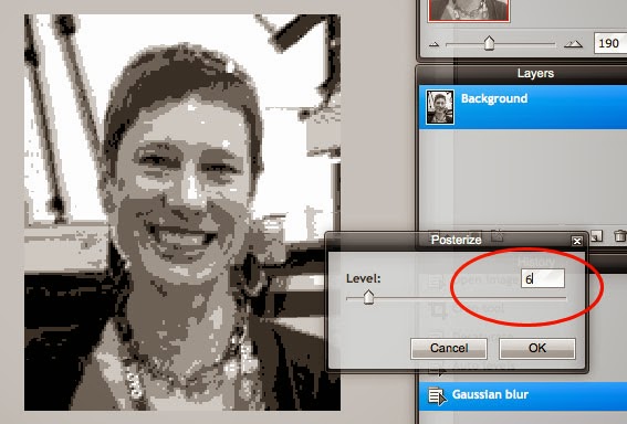
Change the Posterize level to "6"
Now, you can save that pesky image. Or if you've got several, it's time to compare and choose your favorite.
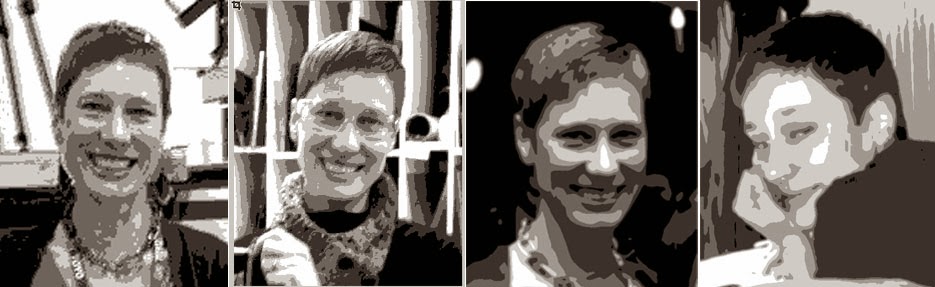
My favorites are the third and fourth images.
 What are your favorite images now? Look at the backgrounds. If you've got a lot of clutter, it tends to distract from your portrait. The first and second image above are guilty of background clutter. They've also got a lot of contrast in weird spots (mainly due to the backgrounds). The image for number one was a small file size to begin with, so it's more pixelated. But number three and four are easier to view. The background in image 4 wasn't totally the same, but it's not too distracting with harsh vertical lines. The values in the background are similar and run into each other. But I think I'll end up painting from photo #3. Time for you to choose your favorite!
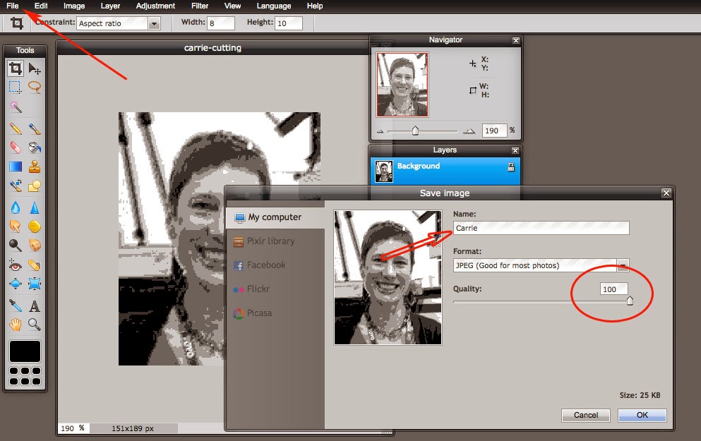
File > Save. Then, name your photo and change the quality to 100.
You'll need to save your file and email it to me. I'll print the image out for you in the right size for Tuesday's class. To save your image, go to the "File" drop down menu and click on "Save." Name your file with your first name. Change the quality setting to 100 and then click okay. Email me your photo and I'll see you on Tuesday! If you've got questions, email me or leave a comment on the blog and I'll try to help you along.


Quick guide: Open Image, Crop tool, Desaturate, Levels, Gaussian blur, Posterize

Thursday, February 20, 2014

Studying Chuck Close Portraits - CLASS co-op art class, Session 1

For the first project of our spring semester in art class, we're working on self portraits in the style of Chuck Close. Chuck Close is a portrait painter whose style has changed over the course of his career.

Vocabulary for this week:
  • portrait
  • value
  • tint
  • shade
  • tone
  • hue
In order to start talking about color, we need to speak the same language. This week's vocabulary terms are related to color. This website is a great primer for getting to know the vocabulary: http://www.color-wheel-artist.com/hue.html. There are also printable color wheels, if you'd like to practice mixing colors at home. If you've got some paints at home, then this practice will help you in getting to know your paints!

I'd like it if you could read the first two pages of Painting Color Class: Tones or Values = What is Tone and Why is it Important to Painting, Perhaps Even More than Color? AND Practice Tone by Painting a Gray Scale or Value Scale. You will recognize this exercise from this week and perhaps start to understand why we are creating our value maps.

Here's a short video that gives an overview of Chuck Close's life and his painting technique:


In the first session of class for this project, we started to create value maps by mixing white with black, and then with blue.
The tonal value maps that we made in the first session of our Unit on Chuck Close.

 In our next session, we will continue to work on our value maps by mixing white with yellow and with red.

After we've created our value maps, we'll begin to work on our self-portraits. The value maps will help us in choosing the right values and colors that we want to fill our portraits with. Next week's homework will be editing a photograph of yourself to use as a guide in creating your portrait. We will be creating a grid on the photo and our canvases.

In this video from the San Francisco Museum of Modern Art, Chuck Close explains why he follows a grid when creating his portraits.


After watching these videos, go to Google and perform an image search for Chuck Close. If you need help on how to do this, email me or leave a comment in the blog post.

While looking at the images, take note of the things that the portraits have in common. Look at the subject matter, the styles, and the backgrounds.  Begin thinking about how you want your portrait to look. Next week, your homework will include taking a "selfie" to transform into a greyscale value map image.

Tuesday, February 18, 2014

Fused Glass Weekend Intensive ~ Architectural Glassarts, Lincoln, NE

Valentine's Day Weekend, 2014
Architectural Glassarts
Lincoln, Nebraska

Woven glass preparation - slumping the strips for our "Warp" pieces
I was very excited to see interest for this kind of a class in Lincoln! Yea! Fused glass is coming! I can schedule more intermediate glass classes as long as there's interest, so let me know if you want more!

The first day was a very busy day! We had a lot on our schedule in order to get the kilns loaded and fully fired before coming back on Sunday to do more work. So, after cutting all the strips for our woven glass and talking about how to form them in different ways and design considerations...

Picking through scrap glass for our screen melts


We pulled out the scrap glass and chose our color combinations for the screen melts. We had a couple of different set-ups in the kiln. The one on the right is a screen melt system from Master Artisan and the other is a homemade screen that my uncle helped me put together. Basically, we found the stainless steel mesh and cut it to fit the length of my kiln dams, folding the sides together so they lock. NOTE:  It's very important to make sure you have plenty of kiln wash on your shelves and furniture, so the glass won't stick.
Screen melts - before firing


I thought initially that it may have been stress due to an annealing problem or incompatibility issues that made the screen melt on the left side of the kiln crack up...but after examining the shelves later, I found some pits where I think glass has eaten through and attached itself to the shelf on a previous firing. So, not enough kiln wash on the shelf, and I think I won't be using that shelf for more high temp work like this.
Screen melts - after firing, with loads of kiln wash on the back


After firing glass to such a high temperature, (screen melts go to 1600ºF and higher) the kiln wash gets embedded in the backside of the melt. So, thanks to Matt for coming in on Sunday and waking up the sandblaster in the basement for some sandblasting of our backsides :)
Matt took care of the kiln wash with the sandblaster


After lunch on day two,  the students gathered 'round the light table and puzzled together the mesh melt pieces, admiring the patterns created by the molten glass.

Gathered around the light table looking at our screen melts


After loading up the screens on day one, we started our frit painting party! We had lots of frit to choose from...Carolina Frit from Slumpy's and Uroboros System 96. At the end of day one, we hadn't quite finished our plates, so we started up early on Sunday.
Frit painting paradise


After finishing the frit plates, we moved on to strip cutting the "weft" pieces of glass for our glass weavings.
Cutting strips of glass for our "weft" pieces - glass weaving


We also pulled some stringers on the torches to add a bit of flair to our woven glass...


Pulling stringers to add to our woven glass
We finished up the day by working with powder wafers, creating them in a brand new way! I've been working with Streuter Technologies (the No Days guys) for the last couple of years to come up with the best powder wafer material for glass fusing. It's finally ready! My class got a sneak peek at it and came up with some great designs, too!
It's little Cyndi Lou Who playing with powders!


Mmm-kay...nuff talk. The pictures tell the rest of the story :)
Chris's powder wafer watermelon


Frit painted pieces are fired. The back side of the pieces
on top, front sides on bottom.


Woven glass and powder wafers going into the kiln.
Drat! I thought I took a picture of the after in the kiln, but the camera went blank, so I'll have to get more pictures tomorrow.

LinkWithin

Related Posts with Thumbnails