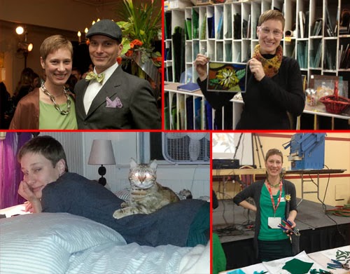
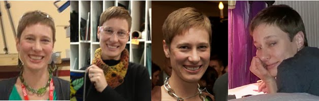
Step one ~ Take a "selfie" or have someone else take your photo. Make sure that you have a monotone background. A wall works really well for this. If you've got a photo that you'd like to use already, you can adjust it to work for our self portrait purpose. Here are several photos that I looked at:
 |
| Several pictures that I had that I thought might work... |
Step two ~ Edit the image using a photo-editing program. If you've
got one you're comfortable with using, feel free to use it. I'll be
giving a short step-by-step for using http://pixlr.com/
To decide which photo I wanted to use, I decided to upload and crop them so that I could get an idea for how I looked, and how my background looked.
When you go to pixlr.com, you will see this:
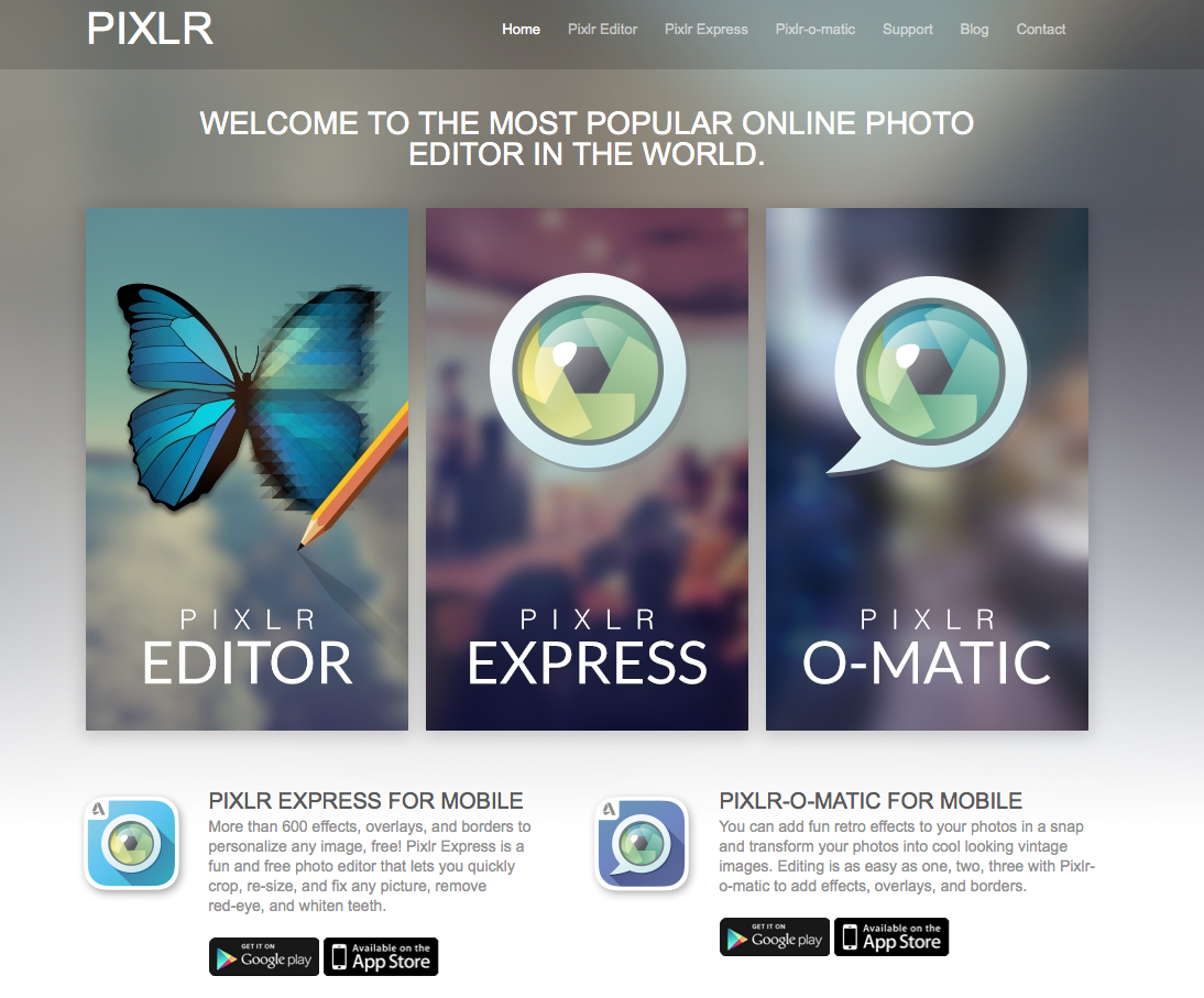 |
| pixlr.com website |
Click on Pixlr Editor (the butterfly at the left) and then we are given the options for retrieving our images. To Upload an image from your computer, click on that option:
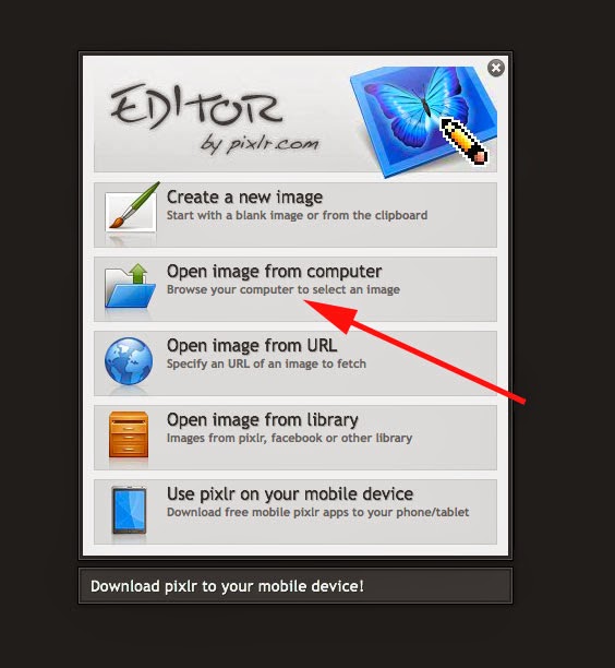 |
| Click on "Open Image from Computer" and find the file you want to upload. |
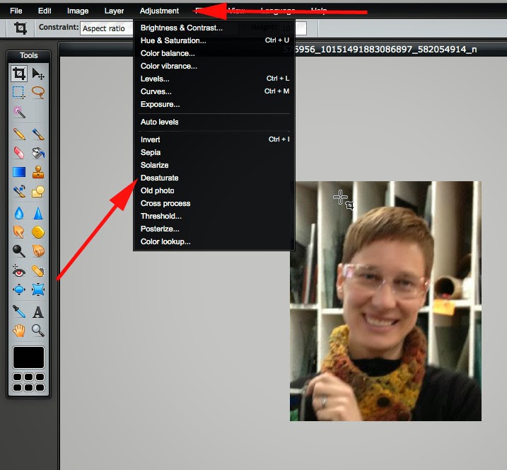
First, we need to crop our image. Select the crop tool if it is not already selected. It's the tool in the very top left of the vertical toolbar to the left of the pixlr program. Change the "Constraint" setting to "Aspect Ratio" with a width of 8 and a height of 10. When cropping the image, try and make your head and face fill about 2/3rds of the frame:
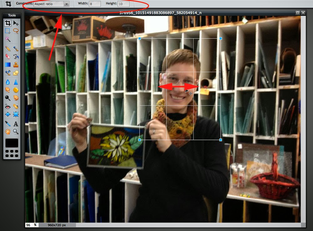 |
Crop: select "aspect ratio" constraint at width=8 and height-10.
Make your face fill about 2/3 of the crop box. |
If you've got several images you want to compare, you can start by cropping them all at once. This might be enough to help you decide which image you like best. I'm leaning towards the third picture below. But, I'm going to demonstrate the next step with the second image, just to see how much or little the background gets in the way with my portrait.
 |
First thing to do is crop off possible portrait pictures
so that your head or face fills most of the frame. |
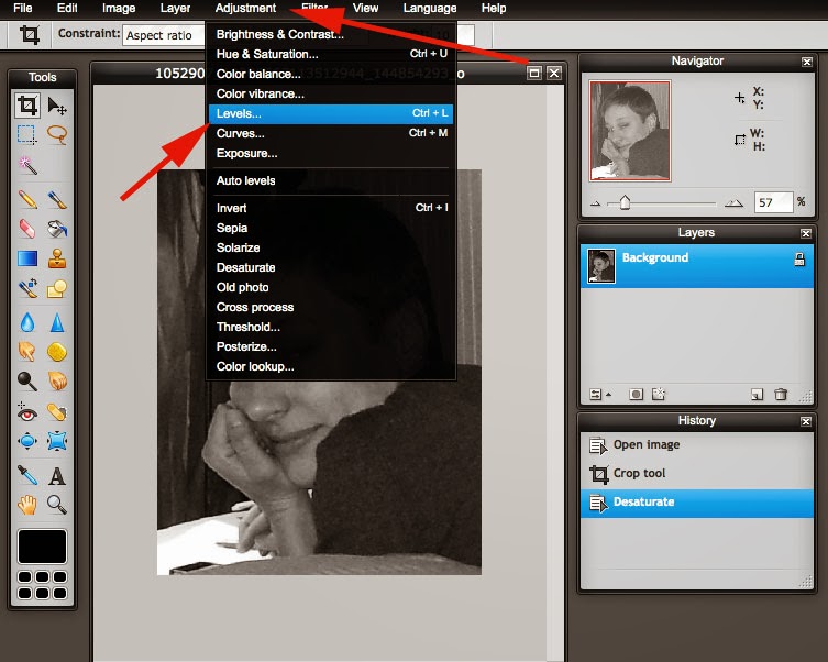
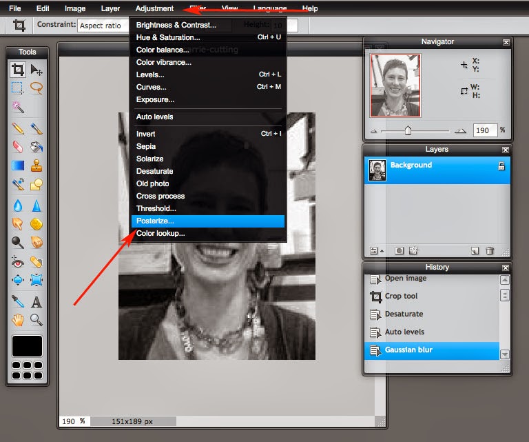
Next step in image editing is to Adjustment > Desaturate. This is the common way that someone will list menu items in editing software. If you go to the top menu bar, you will see "Adjustment" listed halfway across. It's between "Layer" and "Filter." When you select "Adjustment," you'll see a drop down menu with more choices. Head on down to "Desaturate." That's going to take all of the color out of our image, and we'll end up with a greyscale image that's perfect for helping us to judge the values that we'll use when painting.
 |
| Desaturate: Adjustment > Desaturate |
If you're still working on several images, go ahead and desaturate all of them. If you're not sure what steps you've done on the photo, you can always check out the image history:
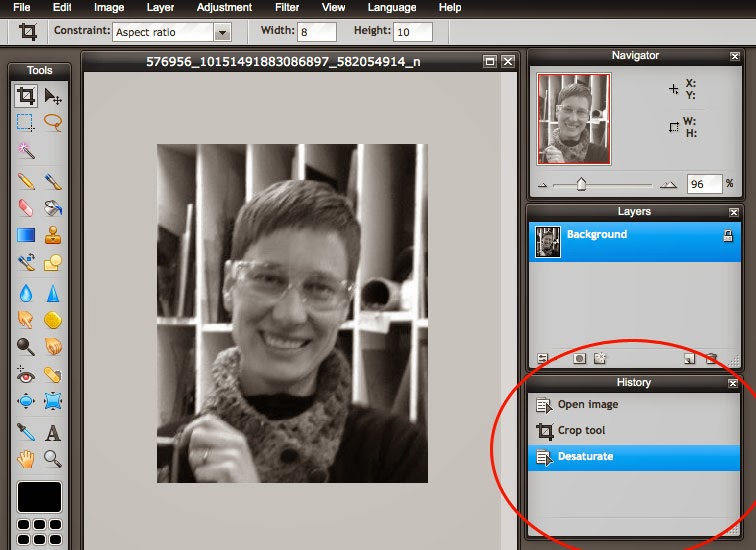 |
| The History window tells you the story of your editing. What step am I on? |
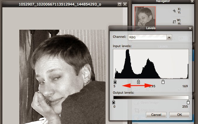
Now, it's time to adjust the brightness of our photo. We're going to do that with "Levels."
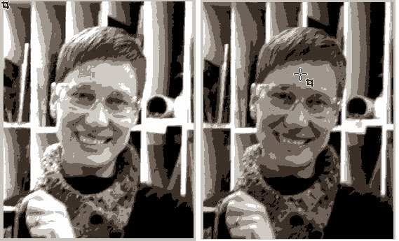 |
The images above have been "Posterized" already.
The only difference between the two is "Levels" adjustment. |
The two images above have already been "Posterized" (last step) to show you the difference that adjusting the Levels makes. Notice that the very light values are missing from the photo on the right. That one did not have it's levels adjusted. Those missing values will make it harder for us to create our portraits, as there will not be as much definition / difference in the values.
 |
| Adjust the levels: Adjustment > Levels |
When you click on the "Levels" option (not "Auto Levels"), a new window pops up that will allow you to adjust the values of your photo.
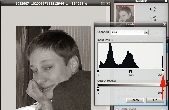 |
A pop up window appears with different slider buttons
for adjusting the values of our photo. |
First, use the white button and slide it to the edge of the "mountains." We want to eliminate any bits of the photo that are too far to the left or right of this window. We want the mountain range to run across the entire rectangle of white in this menu. Does that make sense?
 |
Move the white button slider to the left
until you've almost touched the bottom of the mountain. |
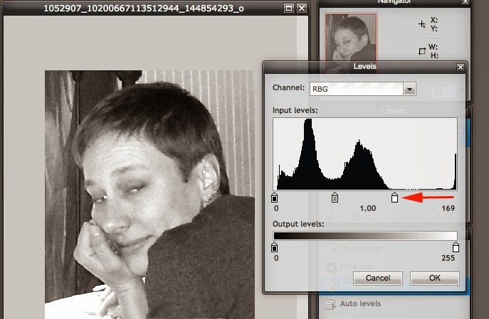
That should have visibly made your photo much lighter. Squint your eyes and look at the photo to see if it needs more adjustment. Do the values have enough contrast? That is, can you see areas that are almost white and areas that are almost black? We want to maintain some areas of grey, too...
If there's a lot of space to the left of the mountains, you'll want to adjust the black button slider, too:
 |
| Move the black button slider to touch the edge of the mountains. |
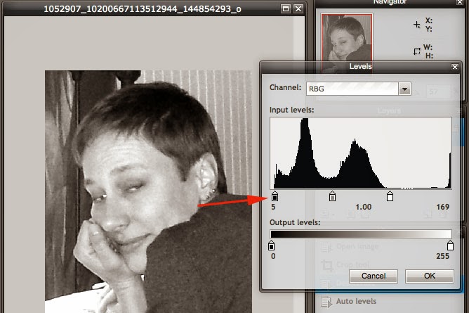
There wasn't a lot of space between the left of the screen and the left of the mountain range in my photo, but it does make a tiny difference. The last slider will help us adjust the values even more.
 |
Play around with the middle slider to see what happens.
If you don't like what you did, press cancel. |
Move the grey slider back and forth and see if you get an image that you like. It should have plenty of light and dark with different levels of midtones (in between the light and dark). If you don't like what you did with the slider, just press "cancel" instead of "ok."
If you feel like you made a mistake and you need to get back to a spot before the editing that you have done, head on over to the history window. It lets you move back and forward between steps to compare what you've done. However, once you make a move, it will replace any previous history (if you've gone backwards and made a move, you can't go forward to the step that you replaced).
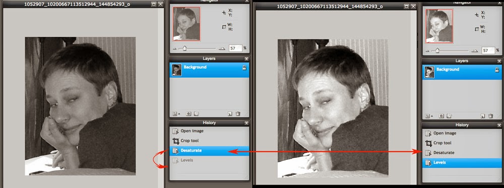 |
You can use your history window to go back and forth between actions.
If you did something you don't like, just go back in time! |
Now, that we're happy with our Levels, we can add a blur effect. We want to use "Gaussian Blur," which lives in the "Filter" drop down menu.
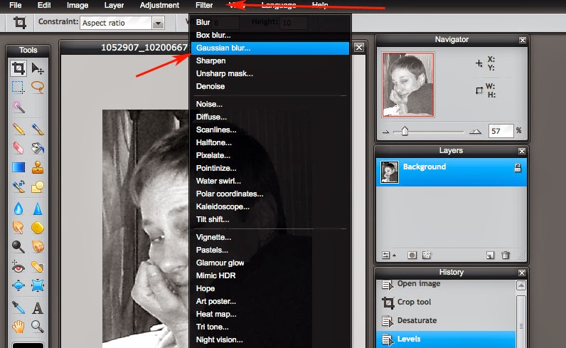 |
| Blur Effect: Filter > Gaussian Blur |
Not all photos will need the blur. The previous photo I was working on didn't need it. The "Gaussian Blur" default in pixlr is "50." That's a lot of blur!
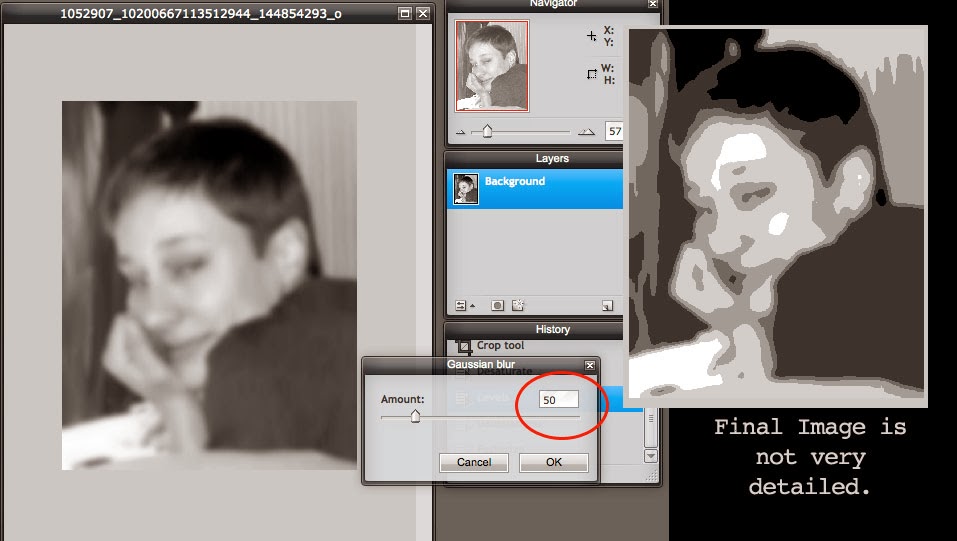 |
If there's too much blur, then we lose detail and our final image
doesn't have as many different values as it could have. |
The example above shows what happens with the final step of "Posterization" if we don't have enough detail. Notice, there's a lot of midtones. Our painting will be very boring if most of the canvas is covered with the same values.
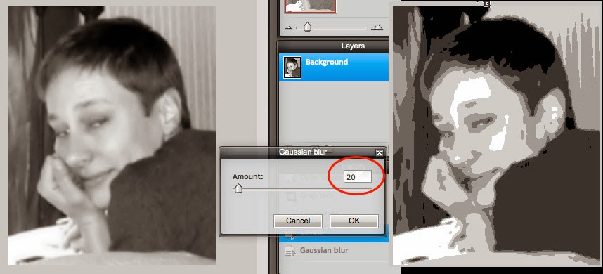 |
Some photos won't need a blur effect.
But, 20 is typically the highest setting we want to use. |
Notice the difference in detail between the two Gaussian Blur images. It's subtle, but important.
Okay! We're almost ready for the last step! I bet you're glad for that, huh?
 |
| Last step: Adjustment > Posterize |
The last step is what changes all of our values into similar groups. We want 6 different values in our photos. So, we need to change the default setting of 4 to 6.
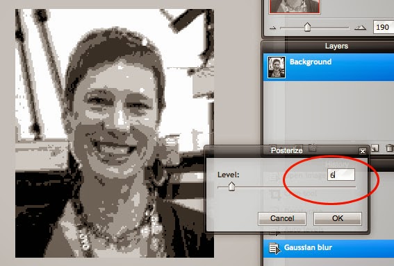 |
| Change the Posterize level to "6" |
Now, you can save that pesky image. Or if you've got several, it's time to compare and choose your favorite.
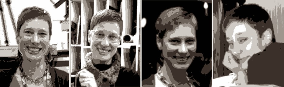 |
| My favorites are the third and fourth images. |
What are your favorite images now? Look at the backgrounds. If you've got a lot of clutter, it tends to distract from your portrait. The first and second image above are guilty of background clutter. They've also got a lot of contrast in weird spots (mainly due to the backgrounds). The image for number one was a small file size to begin with, so it's more pixelated. But number three and four are easier to view. The background in image 4 wasn't totally the same, but it's not too distracting with harsh vertical lines. The values in the background are similar and run into each other. But I think I'll end up painting from photo #3. Time for you to choose your favorite!
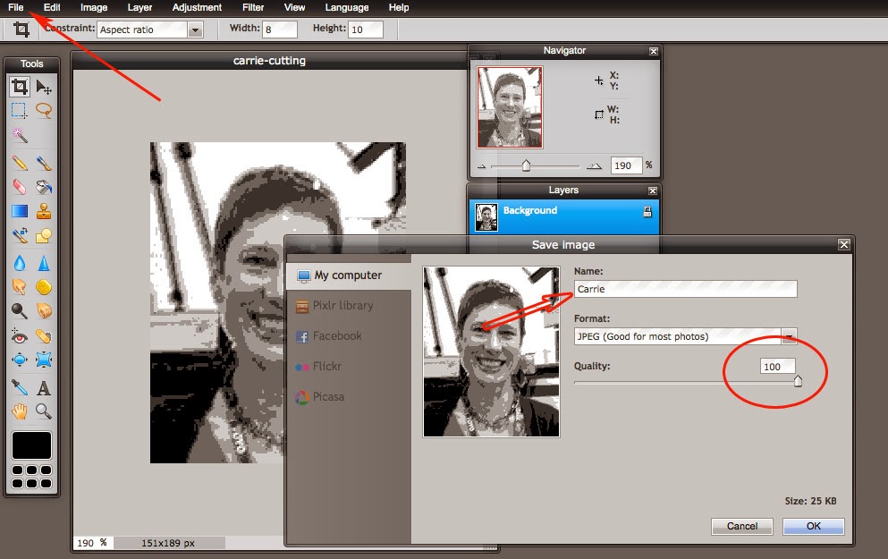 |
| File > Save. Then, name your photo and change the quality to 100. |
You'll need to save your file and email it to me. I'll print the image out for you in the right size for Tuesday's class. To save your image, go to the "File" drop down menu and click on "Save." Name your file with your first name. Change the quality setting to 100 and then click okay. Email me your photo and I'll see you on Tuesday! If you've got questions, email me or leave a comment on the blog and I'll try to help you along.
Quick guide: Open Image, Crop tool, Desaturate, Levels, Gaussian blur, Posterize


